Visualization of Impact of HIV Infection in America
Unique interactive resource from the Rollins School of Public Health at Emory University offers visual depiction of HIV prevalence data.


AIDSvu is “an interactive online map illustrating the prevalence of HIV in the United States” that allows users to “visually explore the HIV epidemic alongside critical resources such as HIV testing center locations, HIV treatment center locations, and NIH-Funded HIV Prevention & Vaccine Trials Sites.”
Created by the Rollins School of Public Health at Emory University, AIDSvu uses state- and county-level data from the US Centers for Disease Control and Prevention’s (CDC) national HIV surveillance database, ZIP code and census tract data from state, county and city health departments, and other HIV surveillance data.
Press materials from the Rollins School of Public Health at Emory University state AIDSvu is “a compilation of interactive online maps that display HIV prevalence data at the national, state and local levels and by different demographics, including age, race and sex. The maps pinpoint areas of the country where the rates of people living with an HIV diagnosis are the highest. These areas include urban centers in the Northeast and the South, and visualize where the needs for prevention, testing, and treatment services are the most urgent.”
Features include:
- National maps displaying 2010 data at the state-and county-level, the most recent national HIV prevalence data available from the CDC
- Interactive maps of HIV prevalence data by census tract for Atlanta, Philadelphia, and Washington, DC
- New ZIP code level maps for Memphis, Orlando, San Diego, Tampa and Virginia Beach
- Updated ZIP code maps for Atlanta, Chicago, Dallas, Detroit, Ft. Lauderdale, Houston, Los Angeles County, Miami, New Orleans, New York City, Palm Beach, Philadelphia, San Francisco, San Juan and Washington, DC
- HIV prevalence maps alongside social determinants of health — poverty, lack of health insurance, median household income, educational attainment and income inequality – in side-by-side map views for 20 cities, in addition to the existing state views
Patrick S. Sullivan, professor of epidemiology at Emory University’s Rollins School of Public Health, and the principal researcher for AIDSVu, said in the press release that the National HIV/AIDS Strategy calls for “reducing new HIV infections by intensifying our efforts in HIV prevention where the epidemic is most concentrated. AIDSVu provides a roadmap to identifying those high-prevalence areas of the HIV epidemic and showing where the local testing resources are located.”
Visit AIDSvu.org to examine the various interactive maps, use the HIV Testing Site and HIV Treatment Site locators, view state-by-state HIV/AIDS profiles, and more.
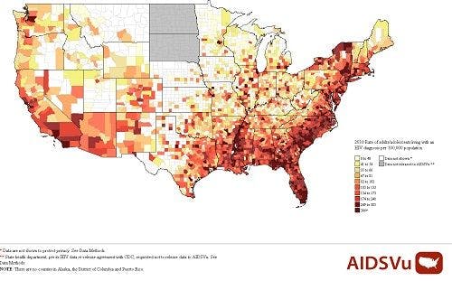
The map below shows “the 2010 rate of adults/adolescents living with an HIV diagnosis per 100,000 population. The darker the area, the higher the rate. Areas shown in white are places where data are not shown (to protect privacy) and gray areas indicate places where data were not released or not available to AIDSVu.”
(Credit: Image courtesy of Emory Health Sciences)